- Splunk Answers
- :
- Using Splunk
- :
- Splunk Search
- :
- Why is my chart overlay not working?
- Subscribe to RSS Feed
- Mark Topic as New
- Mark Topic as Read
- Float this Topic for Current User
- Bookmark Topic
- Subscribe to Topic
- Mute Topic
- Printer Friendly Page
- Mark as New
- Bookmark Message
- Subscribe to Message
- Mute Message
- Subscribe to RSS Feed
- Permalink
- Report Inappropriate Content
Hi,
I need to overlay two values in one chart with a common X axis and a Y axis on either side
chart 1 - column chart: No. of requests per server (X axis - server, Y axis - no. of requests on left side)
chart 2 - line chart : Average Response time per server (X axis - server, Y axis - average response time on right side)
I am using the below code,
<?xml version='1.0' encoding='utf-8'?>
 <dashboard>
   <label>sample overlay simple xml</label>
   <row>
     <chart>
        <search>
          <query><<Filter on data>>| stats avg(Time) by server
                    | appendcols
                 [<<Filter on data>> | stats count by Server]
          </query>
          <earliest>-60m@m</earliest>
          <latest>now</latest>
        </search>
       <title>sample overlay</title>
       <option name="charting.axisTitleX.text">Server Name</option>
       <option name="charting.primaryAxisTitle.text">Server Name</option>

       <option name="charting.data0">results</option>


       <option name="charting.data1">view</option>
       <option name="charting.data1.table">@data0</option>
       <option name="charting.data1.columns">[0,1]</option>
       <option name="charting.chart1.data">@data1</option>
       <option name="charting.chart1">column</option>
       <option name="charting.chart1.nullValueMode">gaps</option>
       <option name="charting.chart1.stackMode">stacked</option>
       <option name="charting.chart1.columnAlignment">0.5</option>

       <option name="charting.data2">view</option>
       <option name="charting.data2.table">@data0</option>
       <option name="charting.data2.columns">[0,2]</option>
       <option name="charting.chart2">line</option>
       <option name="charting.chart2.data">@data2</option>
       <option name="charting.chart2.showMarkers">true</option>
       <option name="charting.chart2.markerSize">5</option>
       <option name="charting.layout.charts">[@chart1,@chart2]</option>
       <option name="charting.layout.axisTitles">[@axisTitleX,@axisTitleY]</option>

     </chart>
   </row>
 </dashboard>
The stats response for the search string is,
I am somehow getting the below output with 2 columns stacked on top of each other.
Please advise.
NOTE: All values are place holders, and do not indicate the original values.
- Mark as New
- Bookmark Message
- Subscribe to Message
- Mute Message
- Subscribe to RSS Feed
- Permalink
- Report Inappropriate Content
In your panel, you need to set the overlay field and enable "View as axis".
See here for how to do that
http://docs.splunk.com/Documentation/Splunk/6.4.3/Viz/Chartcontrols#Chart_overlay_example_.28dual_ax...
- Mark as New
- Bookmark Message
- Subscribe to Message
- Mute Message
- Subscribe to RSS Feed
- Permalink
- Report Inappropriate Content
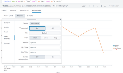
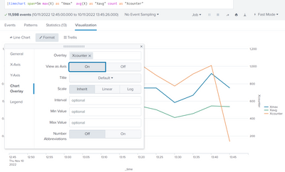
I experienced that the chart overlay is buggy when there are spaces or special characters in the name (though I did realize this effect only in the search, on the Dashboards it worked also with spaces. Splunk v 8.2.3.3). When I removed the space in the field name, the value could be plotted as secondary axis with overlay. Try to remove your brackets by renaming avg(Time).
Anonymized example:
Attempt with space in field namedoes not work. The overlay is ignored and no secondary axis:
Attempt without space in field name works properly:
- Mark as New
- Bookmark Message
- Subscribe to Message
- Mute Message
- Subscribe to RSS Feed
- Permalink
- Report Inappropriate Content
In your panel, you need to set the overlay field and enable "View as axis".
See here for how to do that
http://docs.splunk.com/Documentation/Splunk/6.4.3/Viz/Chartcontrols#Chart_overlay_example_.28dual_ax...
- Mark as New
- Bookmark Message
- Subscribe to Message
- Mute Message
- Subscribe to RSS Feed
- Permalink
- Report Inappropriate Content
Thankyou for your excellent guidance so far.
Just to clarify, the below links seems to suggest that overlaying other chart types are possible. Can you possibly have a look and confirm.
https://answers.splunk.com/answers/81701/chart-overlay-and-different-graph-type.html -I have been using the xml in the above link as a template for my chart.
https://answers.splunk.com/answers/9053/example-of-chart-overlay.html -> Please check answer by V_at_Splunk [Splunk].
Also, the second chart in the link has the line <option name="charting.chart2">line</option>.
I would like to be able to change it to <option name="charting.chart2">column</option>. Is that possible?
- Mark as New
- Bookmark Message
- Subscribe to Message
- Mute Message
- Subscribe to RSS Feed
- Permalink
- Report Inappropriate Content
I looked at these two posts. Both have line chart for the overlay. The second one is HTML dashboard. You could create a HTML dashboard and use d3 objects to create custom visualization. I am not familiar with that.
- Mark as New
- Bookmark Message
- Subscribe to Message
- Mute Message
- Subscribe to RSS Feed
- Permalink
- Report Inappropriate Content
Thankyou sundareshr.
I may also need to change the second chart type to column/area chart so that its like this,
chart 1 - column/area chart: No. of requests per server (X axis - server, Y axis - no. of requests on left side)
chart 2 - column/area chart : Average Response time per server (X axis - server, Y axis - average response time on right side)
Can you please help me out on those lines as well?
Thanks in advance.
- Mark as New
- Bookmark Message
- Subscribe to Message
- Mute Message
- Subscribe to RSS Feed
- Permalink
- Report Inappropriate Content
The overlay charts will have to be line chart. Splunk does not support any other type.


