Turn on suggestions
Auto-suggest helps you quickly narrow down your search results by suggesting possible matches as you type.
Showing results for
Splunk Search
Turn on suggestions
Auto-suggest helps you quickly narrow down your search results by suggesting possible matches as you type.
Showing results for
- Splunk Answers
- :
- Using Splunk
- :
- Splunk Search
- :
- Re: How to edit my search to display a distributio...
Options
- Subscribe to RSS Feed
- Mark Topic as New
- Mark Topic as Read
- Float this Topic for Current User
- Bookmark Topic
- Subscribe to Topic
- Mute Topic
- Printer Friendly Page
- Mark as New
- Bookmark Message
- Subscribe to Message
- Mute Message
- Subscribe to RSS Feed
- Permalink
- Report Inappropriate Content
kualo
Explorer
11-21-2016
08:51 AM
[2016-xx-xx-xx:xx:xx:xxxx] modelName=model1, modelScore=10
[2016-xx-xx-xx:xx:xx:xxxx] modelName=model2, modelScore=100
[2016-xx-xx-xx:xx:xx:xxxx] modelName=model3, modelScore=50
My log looks something like above
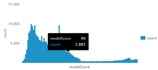
some search| stats count by modelScore | sort modelScore
I have the above search to show the distribution of the modelScore using bar visualization.
However, I would like to show modelScore for each modelName in the same bar graph in different colors.
Is there any way I can do that?
Thanks.
1 Solution
- Mark as New
- Bookmark Message
- Subscribe to Message
- Mute Message
- Subscribe to RSS Feed
- Permalink
- Report Inappropriate Content
gokadroid
Motivator
11-21-2016
09:09 AM
can you try this please based on whichever way you want to chart:
Keeping modelName on x axis
some search| chart count over modelName by modelScore
OR
Keeping modelScore on x axis
some search| chart count over modelScore by modelName
- Mark as New
- Bookmark Message
- Subscribe to Message
- Mute Message
- Subscribe to RSS Feed
- Permalink
- Report Inappropriate Content
aljohnson_splun

Splunk Employee
11-22-2016
08:26 AM
You probably want to use some search| stats count by modelScore | makecontinuous modelScore as to add any potentially empty buckets/bins.
- Mark as New
- Bookmark Message
- Subscribe to Message
- Mute Message
- Subscribe to RSS Feed
- Permalink
- Report Inappropriate Content
gokadroid
Motivator
11-21-2016
09:09 AM
can you try this please based on whichever way you want to chart:
Keeping modelName on x axis
some search| chart count over modelName by modelScore
OR
Keeping modelScore on x axis
some search| chart count over modelScore by modelName
- Mark as New
- Bookmark Message
- Subscribe to Message
- Mute Message
- Subscribe to RSS Feed
- Permalink
- Report Inappropriate Content
kualo
Explorer
11-22-2016
08:31 AM
Thanks! I works perfectly.
Get Updates on the Splunk Community!
Index This | Forward, I’m heavy; backward, I’m not. What am I?
April 2024 Edition
Hayyy Splunk Education Enthusiasts and the Eternally Curious!
We’re back with another ...
A Guide To Cloud Migration Success
As enterprises’ rapid expansion to the cloud continues, IT leaders are continuously looking for ways to focus ...
Join Us for Splunk University and Get Your Bootcamp Game On!
If you know, you know! Splunk University is the vibe this summer so register today for bootcamps galore ...

