- Splunk Answers
- :
- Using Splunk
- :
- Dashboards & Visualizations
- :
- Re: how to force timechart to display zero for nul...
- Subscribe to RSS Feed
- Mark Topic as New
- Mark Topic as Read
- Float this Topic for Current User
- Bookmark Topic
- Subscribe to Topic
- Mute Topic
- Printer Friendly Page
- Mark as New
- Bookmark Message
- Subscribe to Message
- Mute Message
- Subscribe to RSS Feed
- Permalink
- Report Inappropriate Content
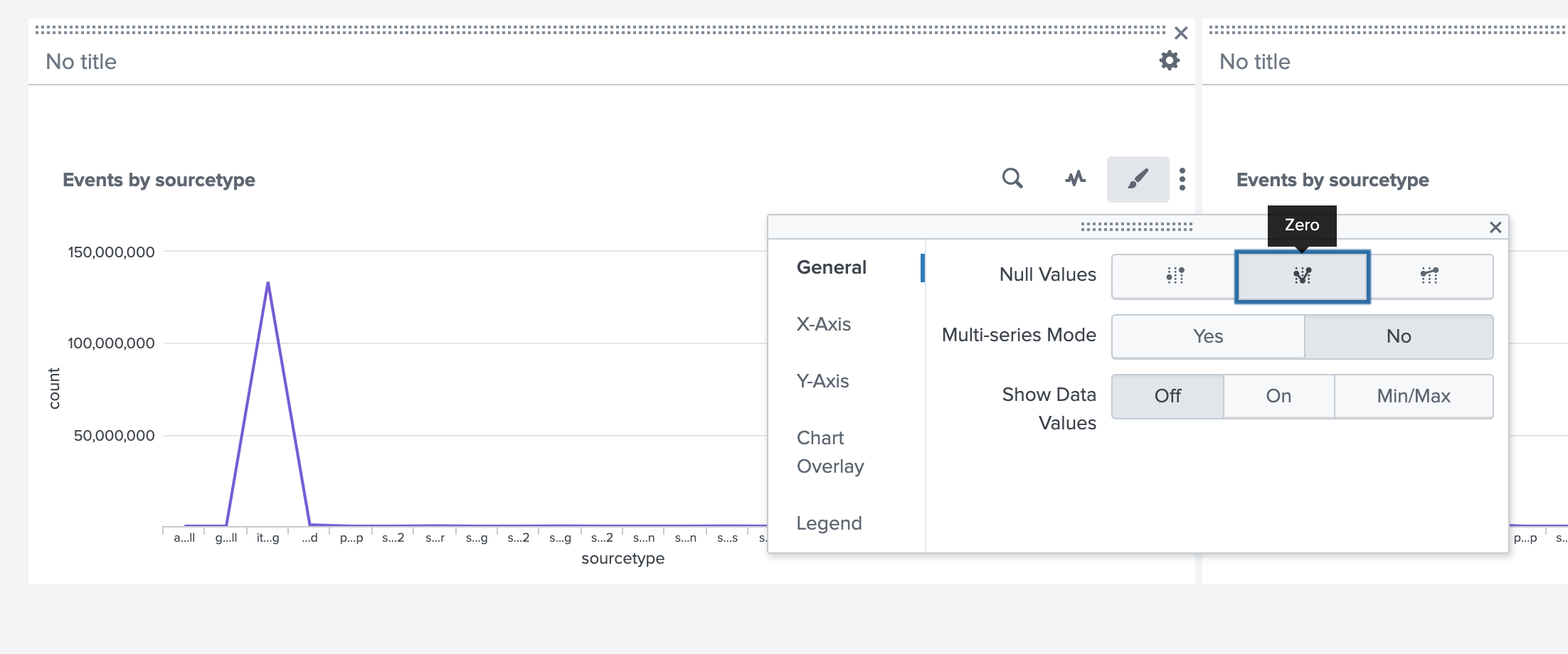
I'd like to display the "user count" on a timechart over a 30 day period such that even when only a single day has a count above zero, my line graph will still look like a colored line moving along the base of the x axis until a single spike appears on the day there was a count about zero. Without this, I simply get a dot on a blank page.
I could use a bar graph, but even so, it provides no perspective since the left and right limits (day1 and day 30) dont even show a date value
my search...
index=myindex
action="what im looking for"
| bin span=1d _time
| stats DC(user) as "user_count" by _time
- Mark as New
- Bookmark Message
- Subscribe to Message
- Mute Message
- Subscribe to RSS Feed
- Permalink
- Report Inappropriate Content
HI @mikefoti
Try using the timechart command instead, I think it will fix your issues
index=myindex action="what im looking for"
| timechart span=1m DC(user) as "user_count"
Hope this helps
- Mark as New
- Bookmark Message
- Subscribe to Message
- Mute Message
- Subscribe to RSS Feed
- Permalink
- Report Inappropriate Content
- Mark as New
- Bookmark Message
- Subscribe to Message
- Mute Message
- Subscribe to RSS Feed
- Permalink
- Report Inappropriate Content
HI @mikefoti
Try using the timechart command instead, I think it will fix your issues
index=myindex action="what im looking for"
| timechart span=1m DC(user) as "user_count"
Hope this helps
Stay Connected: Your Guide to May Tech Talks, Office Hours, and Webinars!
They're back! Join the SplunkTrust and MVP at .conf24
Enterprise Security Content Update (ESCU) | New Releases
