- Splunk Answers
- :
- Using Splunk
- :
- Splunk Search
- :
- How to change highcharts data label shape
- Subscribe to RSS Feed
- Mark Topic as New
- Mark Topic as Read
- Float this Topic for Current User
- Bookmark Topic
- Subscribe to Topic
- Mute Topic
- Printer Friendly Page
- Mark as New
- Bookmark Message
- Subscribe to Message
- Mute Message
- Subscribe to RSS Feed
- Permalink
- Report Inappropriate Content
How to change highcharts data label shape
Hello,
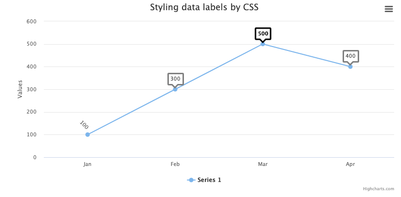
I've got a time chart and wanted to know if it is possible to change the data label so it's surrounded by a conversation bubble. I know this is possible with CSS, though the class assigned to the data labels (highcharts-data-label) doesn't seem to accept border through CSS. This seems to be possible using the highcharts-data-label box, though that class appears to be in use for the box that appears when hovering over a point instead of on the data labels.
Highcharts has the following sample - hxxps :// jsfiddle.net/gh/get/jquery/1.7.2/highcharts/highcharts/tree/master/samples/highcharts/css/series-datalabels/
This is the type of data label that I'm trying to get:
Here is what I currently have (using CSS outline for the label):
Does anyone have experience with this?

