Turn on suggestions
Auto-suggest helps you quickly narrow down your search results by suggesting possible matches as you type.
Showing results for
Dashboards & Visualizations
Turn on suggestions
Auto-suggest helps you quickly narrow down your search results by suggesting possible matches as you type.
Showing results for
- Splunk Answers
- :
- Using Splunk
- :
- Dashboards & Visualizations
- :
- Y-axis log automatic max truncates
Options
- Subscribe to RSS Feed
- Mark Topic as New
- Mark Topic as Read
- Float this Topic for Current User
- Bookmark Topic
- Subscribe to Topic
- Mute Topic
- Printer Friendly Page
- Mark as New
- Bookmark Message
- Subscribe to Message
- Mute Message
- Subscribe to RSS Feed
- Permalink
- Report Inappropriate Content
Y-axis log automatic max truncates
bsayatovic_ipco
Engager
12-23-2019
06:16 AM
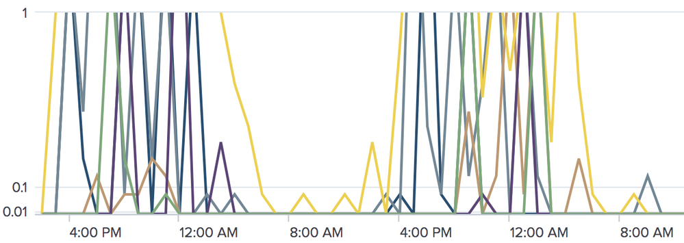
I have a line chart showing data with values between 0 and 9. Using a log Y-axis but letting the max be automatically derived, it chooses a max of 1, so the peaks are clipped/truncated/cropped. If I artificially add a little to each value so the max is 11, it chooses 100 as the max.
While I could set my own max, the max will vary quite a bit over time to I'd prefer an adaptive chart.
Why isn't Splunk choosing the next higher log scale to include all data?
Get Updates on the Splunk Community!
Threat Hunting Unlocked: How to Uplevel Your Threat Hunting With the PEAK Framework ...
WATCH NOWAs AI starts tackling low level alerts, it's more critical than ever to uplevel your threat hunting ...
Splunk APM: New Product Features + Community Office Hours Recap!
Howdy Splunk Community! Over the past few months, we’ve had a lot going on in the world of Splunk Application ...
Index This | Forward, I’m heavy; backward, I’m not. What am I?
April 2024 Edition
Hayyy Splunk Education Enthusiasts and the Eternally Curious!
We’re back with another ...

