Turn on suggestions
Auto-suggest helps you quickly narrow down your search results by suggesting possible matches as you type.
Showing results for
All Apps and Add-ons
Turn on suggestions
Auto-suggest helps you quickly narrow down your search results by suggesting possible matches as you type.
Showing results for
- Apps and Add-ons
- :
- All Apps and Add-ons
- :
- Question regarding heat map and tile visualization...
Options
- Subscribe to RSS Feed
- Mark Topic as New
- Mark Topic as Read
- Float this Topic for Current User
- Bookmark Topic
- Subscribe to Topic
- Mute Topic
- Printer Friendly Page
- Mark as New
- Bookmark Message
- Subscribe to Message
- Mute Message
- Subscribe to RSS Feed
- Permalink
- Report Inappropriate Content
Question regarding heat map and tile visualizations
jh007
New Member
01-18-2018
01:29 PM
I have a dashboard where I have attempted to create heat maps based on a range. The problem I have is that I have multiple Splunk servers I am deploying in different environments that are all different sizes; hence, I can't use the same number range for heat mapping on all of my systems because of the size differences.
What I would like to know is if it is possible to set heat map ranges based on percentages rather than hard numbers (e.g. stay green if < 1%, turn yellow if > 5% and turn red at 10%).
- Mark as New
- Bookmark Message
- Subscribe to Message
- Mute Message
- Subscribe to RSS Feed
- Permalink
- Report Inappropriate Content
mdorobek
Path Finder
03-16-2018
05:49 AM
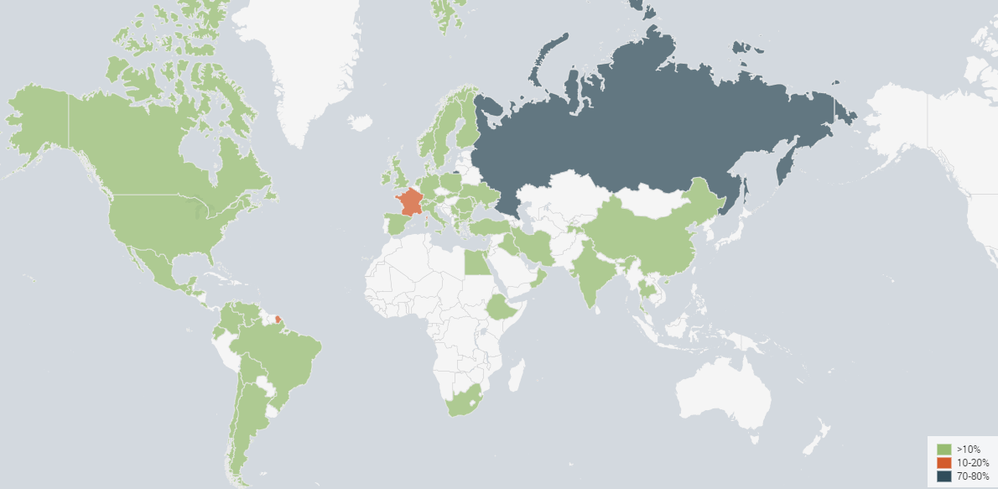
Heres an example by using the coropleth map, I hope this helps:
index=foo
| eventstats count as total
| iplocation src_ip
| stats count by Country, total
| eval percentage=round((count/total)*100, 2)
| fields Country, percentage
| eval percentage=case(percentage<10,"<10%",percentage<20,"10-20%", percentage<30,"20-30%", percentage<40,"30-40%", percentage<50,"40-50%", percentage<60,"50-60%", percentage<70,"60-70%", percentage<80,"70-80%", percentage<80,"80-90%", percentage<100,"90-100%")
| geom geo_countries featureIdField=Country
Get Updates on the Splunk Community!
Introducing the Splunk Community Dashboard Challenge!
Welcome to Splunk Community Dashboard Challenge! This is your chance to showcase your skills in creating ...
Built-in Service Level Objectives Management to Bridge the Gap Between Service & ...
Wednesday, May 29, 2024 | 11AM PST / 2PM ESTRegister now and join us to learn more about how you can ...
Get Your Exclusive Splunk Certified Cybersecurity Defense Engineer Certification at ...
We’re excited to announce a new Splunk certification exam being released at .conf24! If you’re headed to Vegas ...

