- Splunk Answers
- :
- Using Splunk
- :
- Dashboards & Visualizations
- :
- Can you change the colors in bar graph results and...
- Subscribe to RSS Feed
- Mark Topic as New
- Mark Topic as Read
- Float this Topic for Current User
- Bookmark Topic
- Subscribe to Topic
- Mute Topic
- Printer Friendly Page
- Mark as New
- Bookmark Message
- Subscribe to Message
- Mute Message
- Subscribe to RSS Feed
- Permalink
- Report Inappropriate Content
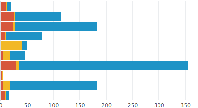
I have a bar graph as below
Now how can change my current colors to display like below constantly, like every time I want to see only the below colors.
The following is my current html code. Now exactly where should I have to specify the above three color names.
option name="charting.axisLabelsX.majorLabelStyle.overflowMode" ellipsisNone
option name="charting.axisLabelsX.majorLabelStyle.rotation" 0
option name="charting.axisTitleX.visibility">collapsed
option name="charting.axisTitleY.visibility">visible
option name="charting.axisTitleY2.visibility">visible
option name="charting.axisX.scale">linear
option name="charting.axisY.scale">linear
option name="charting.axisY2.enabled">0
option name="charting.axisY2.scale">inherit
option name="charting.chart">bar
option name="charting.chart.bubbleMaximumSize">50
option name="charting.chart.bubbleMinimumSize">10
option name="charting.chart.bubbleSizeBy">area
option name="charting.chart.nullValueMode">gaps
option name="charting.chart.showDataLabels">none
option name="charting.chart.sliceCollapsingThreshold">0.01
option name="charting.chart.stackMode">stacked
option name="charting.chart.style">shiny
option name="charting.drilldown">all
option name="charting.layout.splitSeries">0
option name="charting.layout.splitSeries.allowIndependentYRanges">0
option name="charting.legend.labelStyle.overflowMode">ellipsisEnd
option name="charting.legend.placement">top
- Mark as New
- Bookmark Message
- Subscribe to Message
- Mute Message
- Subscribe to RSS Feed
- Permalink
- Report Inappropriate Content
@pavanae for us to help you better you would need to also provide the series names being plotted in the bar chart or in other words the names of the legend.
There are two options you have:
1) If you know the series names use <option name="charting.fieldColors">{"yourField1": 0x425b3c, "yourField2": 0x5b3c53, "yourField3": 0xc98b06}</option>
2) If your series names can change (but count remains fixed), you can use <option name="charting.seriesColors">{0x425b3c, 0x5b3c53,0xc98b06}</option>.
Please try out and confirm. Refer to documentation for detais: https://docs.splunk.com/Documentation/Splunk/latest/Viz/ChartConfigurationReference#General_chart_pr...
Just FYI, what you have shared is Simple XML dashbaord, not HTML.
| makeresults | eval message= "Happy Splunking!!!"


