Turn on suggestions
Auto-suggest helps you quickly narrow down your search results by suggesting possible matches as you type.
Showing results for
Dashboards & Visualizations
Turn on suggestions
Auto-suggest helps you quickly narrow down your search results by suggesting possible matches as you type.
Showing results for
- Splunk Answers
- :
- Using Splunk
- :
- Dashboards & Visualizations
- :
- How can I show a key to define each color of my pi...
Options
- Subscribe to RSS Feed
- Mark Topic as New
- Mark Topic as Read
- Float this Topic for Current User
- Bookmark Topic
- Subscribe to Topic
- Mute Topic
- Printer Friendly Page
- Mark as New
- Bookmark Message
- Subscribe to Message
- Mute Message
- Subscribe to RSS Feed
- Permalink
- Report Inappropriate Content
How can I show a key to define each color of my pie-chart?
tamduong16
Contributor
08-11-2017
02:54 PM
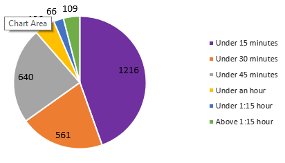
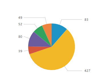
Is there a way I could get Splunk to display piechart like this?
I want it to display what each color is and the count of each slice. I were able to get it to display only the count for each slice (below image) but I need to see the description of the color on the side.
- Mark as New
- Bookmark Message
- Subscribe to Message
- Mute Message
- Subscribe to RSS Feed
- Permalink
- Report Inappropriate Content
woodcock
Esteemed Legend
08-11-2017
04:20 PM
Run this search and show it as a pie chart. Then look at how it looks on the Statistics tab; make your data look like that and it will show properly:
index=_* | chart count BY sourcetype
- Mark as New
- Bookmark Message
- Subscribe to Message
- Mute Message
- Subscribe to RSS Feed
- Permalink
- Report Inappropriate Content
lfedak_splunk

Splunk Employee
08-11-2017
03:17 PM
Hey @tamduong16, This might help you: https://answers.splunk.com/answers/170278/how-to-add-a-color-coded-legend-with-text-to-a-pie.html
Get Updates on the Splunk Community!
Extending Observability Content to Splunk Cloud
Watch Now!
In this Extending Observability Content to Splunk Cloud Tech Talk, you'll see how to leverage ...
More Control Over Your Monitoring Costs with Archived Metrics!
What if there was a way you could keep all the metrics data you need while saving on storage costs?This is now ...
New in Observability Cloud - Explicit Bucket Histograms
Splunk introduces native support for histograms as a metric data type within Observability Cloud with Explicit ...


