- Splunk Answers
- :
- Using Splunk
- :
- Splunk Search
- :
- Graph - slowest host and average response time acr...
- Subscribe to RSS Feed
- Mark Topic as New
- Mark Topic as Read
- Float this Topic for Current User
- Bookmark Topic
- Subscribe to Topic
- Mute Topic
- Printer Friendly Page
- Mark as New
- Bookmark Message
- Subscribe to Message
- Mute Message
- Subscribe to RSS Feed
- Permalink
- Report Inappropriate Content
Graph - slowest host and average response time across hosts
Hi,
I have around 15 servers in my cluster for an application. I need to do a timechart with the below specifications,
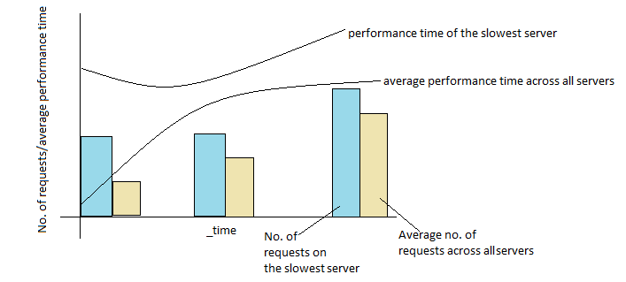
X Axis: _time (per minute)
Y Axis: No. of requests, performance time
As line graphs: Average performance time across all servers, slowest server (i.e. server with the maximum performance time)
As bar graphs: Average no. of requests across all servers, no. of requests on the slowest server
The slowest server will vary every minute because I have 15 servers. The line graph and bar graph for the slowest server will therefore be plotted for different servers every minute.
Kindly help me out with the search query.
Thanks in advance.
- Mark as New
- Bookmark Message
- Subscribe to Message
- Mute Message
- Subscribe to RSS Feed
- Permalink
- Report Inappropriate Content
I was trying to figure out how to do this with timechart, but wasn't having much luck. I think others here may be able to help if that's needed.
But if you know the time span, maybe stats would work? I wasn't sure how you were defining the slowest performing server, so I'm assuming the server that has the slowest performance value over an interval is the slowest, but I guess it could be the slowest on average over the interval too?
[your base search]
| bucket _time span=5m
| stats count as max_count max(resp_time) as server_max_resp_time avg(resp_time) as server_avg_resp_time by _time server
| eventstats avg(max_count) as avg_count max(server_max_resp_time) as max_resp_time avg(server_avg_resp_time) as avg_resp_time by _time
| where max_resp_time = server_max_resp_time
| dedup _time
| fields - server*
So this will bucket the data into 5m intervals. Then we run stats get a count of events, max response time and average response time per server per interval.
Then using eventstats, we get stats across just the interval (so across all servers) - average count of events, the slowest response time and the average response time.
Now we just keep those records where the slowest response time of the server matches the overall slowest response time for the period. In case more than one server have the same slowest response time, we get rid of any dup time periods. And finally drop our server specific fields.
So we're left with a max count, which represents the count of events on the slowest server as well as the average count across all servers. And of course the same concept for the max response time and average response time.
The last thing to do would be to create a column chart and select the the max/avg response time fields for the chart overlay.

