Turn on suggestions
Auto-suggest helps you quickly narrow down your search results by suggesting possible matches as you type.
Showing results for
Dashboards & Visualizations
Turn on suggestions
Auto-suggest helps you quickly narrow down your search results by suggesting possible matches as you type.
Showing results for
- Splunk Answers
- :
- Using Splunk
- :
- Dashboards & Visualizations
- :
- sub aggregation pie chart with splunk ?
Options
- Subscribe to RSS Feed
- Mark Topic as New
- Mark Topic as Read
- Float this Topic for Current User
- Bookmark Topic
- Subscribe to Topic
- Mute Topic
- Printer Friendly Page
- Mark as New
- Bookmark Message
- Subscribe to Message
- Mute Message
- Subscribe to RSS Feed
- Permalink
- Report Inappropriate Content
mcarpentier
Engager
09-05-2016
09:30 AM
Hi all,
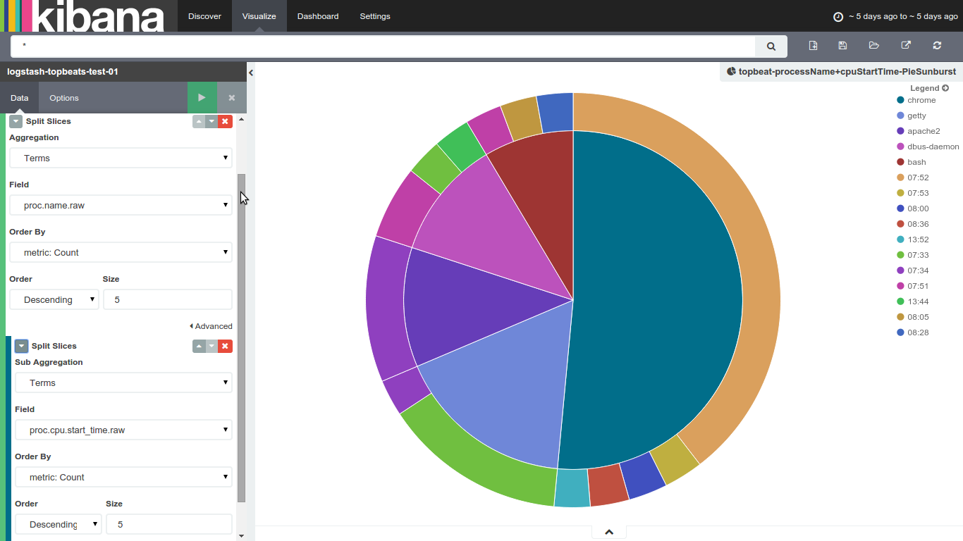
New to splunk, i'm quite used to kibana's sub aggreagation charts, like the one below : it's a very convenient way to show some of my datas
i know Splunk's pie charts are limited to one column, what would the best way to achieve that kind of visualization (sub aggregation ones) in splunk ?
Thanks for your help
Max
1 Solution
- Mark as New
- Bookmark Message
- Subscribe to Message
- Mute Message
- Subscribe to RSS Feed
- Permalink
- Report Inappropriate Content
inventsekar

SplunkTrust
09-06-2016
08:31 AM

- Mark as New
- Bookmark Message
- Subscribe to Message
- Mute Message
- Subscribe to RSS Feed
- Permalink
- Report Inappropriate Content
inventsekar
SplunkTrust
09-06-2016
08:31 AM
Get Updates on the Splunk Community!
Extending Observability Content to Splunk Cloud
Watch Now!
In this Extending Observability Content to Splunk Cloud Tech Talk, you'll see how to leverage ...
More Control Over Your Monitoring Costs with Archived Metrics!
What if there was a way you could keep all the metrics data you need while saving on storage costs?This is now ...
New in Observability Cloud - Explicit Bucket Histograms
Splunk introduces native support for histograms as a metric data type within Observability Cloud with Explicit ...
