- Splunk Answers
- :
- Using Splunk
- :
- Splunk Search
- :
- How to capture 3 dimensions in chart/table
- Subscribe to RSS Feed
- Mark Topic as New
- Mark Topic as Read
- Float this Topic for Current User
- Bookmark Topic
- Subscribe to Topic
- Mute Topic
- Printer Friendly Page
- Mark as New
- Bookmark Message
- Subscribe to Message
- Mute Message
- Subscribe to RSS Feed
- Permalink
- Report Inappropriate Content
How to capture 3 dimensions in chart/table
Hello,
I have been struggling with this for a while. I would like to create dashboard for following use case: QA dashboard which shows latest tests result. I have events in this format:
name: testA
status:  fail
build:  387
timestamp:  2016-05-19T04:37:00+00:00
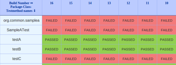
I am not sure what would be better solution whether chart or table. Here is the dashboard I would like to create:
Table solution
Dashboard could look like this:
However, here I do not know how to create columns dynamically (for instance last 20 builds). I know I could probably do workaround and rotate the table, so I would end up with one column for latest builds. But I am worry this would reduce dashboard readability (especially because I plan to have more tables like this in one dashboard).
Chart Solution
Chart would have x-axis is build number, y-axis is set of all tests and legend has test results. Example:
I created stacked chart using this:
earliest=-14d latest=now | chart count over testSuiteBuildNumber by name
I am not sure which tool (chart, table anything else) and arguments would be best to explore and learn in order to get the result I want.
Do you have any advice?
Thank you.
- Mark as New
- Bookmark Message
- Subscribe to Message
- Mute Message
- Subscribe to RSS Feed
- Permalink
- Report Inappropriate Content
Take at look at the Splunk 6.x Dashboard Examples app. There is an example for Table Cell Highlighting. See if that might work for you.


