Turn on suggestions
Auto-suggest helps you quickly narrow down your search results by suggesting possible matches as you type.
Showing results for
Splunk Search
Turn on suggestions
Auto-suggest helps you quickly narrow down your search results by suggesting possible matches as you type.
Showing results for
- Splunk Answers
- :
- Using Splunk
- :
- Splunk Search
- :
- PIE CHART mouseover is displaying 100% value from ...
Options
- Subscribe to RSS Feed
- Mark Topic as New
- Mark Topic as Read
- Float this Topic for Current User
- Bookmark Topic
- Subscribe to Topic
- Mute Topic
- Printer Friendly Page
- Mark as New
- Bookmark Message
- Subscribe to Message
- Mute Message
- Subscribe to RSS Feed
- Permalink
- Report Inappropriate Content
the_wolverine
Champion
02-06-2015
03:33 PM
My search:
- | chart max(REPORTING) as REPORTING max(MISSING) as MISSING
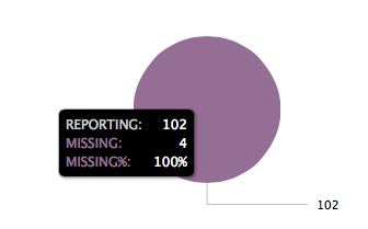
The table looks fine, 2 columns, REPORTING and MISSING, with value of 102 REPORTING and 4 MISSING.
The pie chart looks like this:
Where is 100% coming from? How do I remove it?
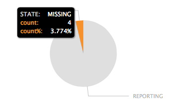
And if I add "| transpose" I get this chart with unwanted row/column text:
1 Solution
- Mark as New
- Bookmark Message
- Subscribe to Message
- Mute Message
- Subscribe to RSS Feed
- Permalink
- Report Inappropriate Content
the_wolverine
Champion
02-06-2015
03:58 PM
Workaround this by using transpose and rename the column and "row 1":
| chart max(REPORTING) as
"REPORTING" max(MISSING) as "MISSING" | transpose | rename "row 1" as count "column" as STATE
- Mark as New
- Bookmark Message
- Subscribe to Message
- Mute Message
- Subscribe to RSS Feed
- Permalink
- Report Inappropriate Content
the_wolverine
Champion
02-06-2015
03:58 PM
Get Updates on the Splunk Community!
.conf24 | Registration Open!
Hello, hello! I come bearing good news: Registration for .conf24 is now open!
conf is Splunk’s rad annual ...
ICYMI - Check out the latest releases of Splunk Edge Processor
Splunk is pleased to announce the latest enhancements to Splunk Edge Processor.
HEC Receiver authorization ...
Introducing the 2024 SplunkTrust!
Hello, Splunk Community! We are beyond thrilled to announce our newest group of SplunkTrust members!
The ...


